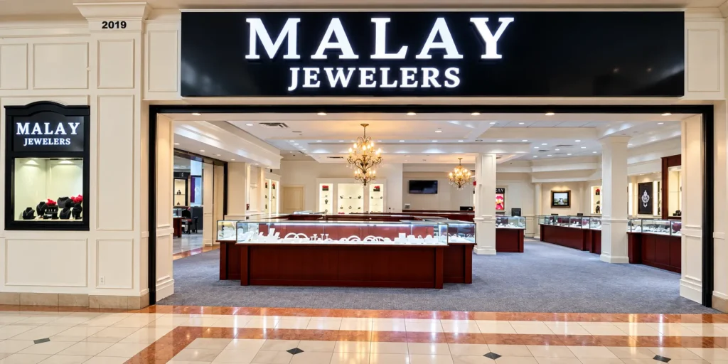
A jewelry storefront should communicate quality before a customer even enters the shop. For our recently completed Malay Jewelers project in the USA, we produced premium Jewelry Store Signs using illuminated 3D channel letters with bright white acrylic faces, deep black sides, internal LED lighting, and a clean black mounting background.
The objective was not simply to make the business name visible. The complete sign needed to look refined in daylight, maintain strong readability from different viewing angles, and create a bright premium appearance after dark. The finished “MALAY JEWELERS” signage demonstrates how carefully fabricated acrylic-faced channel letters can transform a retail storefront into a stronger, more recognizable brand.
Malay Jewelers USA: Project Overview
Malay Jewelers required a storefront sign that matched the premium nature of a jewelry business. Jewelry retailers usually need a different visual approach from restaurants, convenience stores, supermarkets, or entertainment businesses. Excessive colors or complicated effects can make the storefront feel busy. A jewelry sign generally benefits from controlled contrast, elegant typography, consistent illumination, and clean fabrication.
For this project, “MALAY” was designed as the dominant brand name, while “JEWELERS” was positioned underneath in a smaller but highly visible format.
The completed signage features:
- Large three-dimensional illuminated letters
- White translucent acrylic faces
- Deep black letter sides
- Internal white LED illumination
- Black background panel
- High-contrast black-and-white styling
- Clearly separated primary and secondary text
- Clean letter spacing
- Strong daytime readability
- Bright nighttime illumination
This combination gives the storefront a sophisticated appearance without making the design unnecessarily complicated.
What Type of Letters Were Used?
The Malay Jewelers sign is best described as a front-lit acrylic-faced LED channel letter sign.
There is often confusion between acrylic letters and channel letters. They are related, but they are not exactly the same product.
A basic acrylic letter may simply be cut from a sheet of acrylic. It can be installed directly onto a wall, mounted using spacers, or combined with other materials. A channel letter is a deeper fabricated letter with an internal cavity designed to accommodate lighting and electrical components.
The front surface is typically made from light-transmitting acrylic. LED modules are installed inside the letter, allowing the face to illuminate evenly.
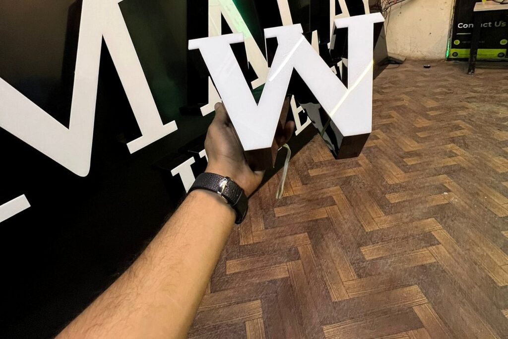
In the Malay Jewelers project, the white illuminated face creates the brightness customers see from the front, while the black side profile gives each character depth and visual strength.
The close-up image also shows why three-dimensional lettering looks considerably more substantial than a flat printed board. When viewed from an angle, the depth of the return remains visible and gives the sign an architectural quality.
Why Jewelry Store Signs Need a Premium Finish
Customers purchasing jewelry are often making a high-value or emotionally important purchase. The appearance of the store can influence their expectations before they have even seen the products.
Professional Jewelry Store Signs help communicate that the business is established, trustworthy, and serious about presentation.
A well-built exterior sign can provide several advantages:
- Stronger first impressions
- Greater visibility from the street
- Better nighttime recognition
- Improved brand consistency
- More professional storefront photography
- Stronger visibility on Google Business Profile images
- Better recognition among returning customers
- A premium appearance compared with ordinary flat signage
For luxury-oriented businesses, construction quality matters just as much as design. Poorly aligned letters, uneven illumination, visible wiring, weak mounting, or inconsistent spacing can reduce the perceived quality of the entire storefront.
For that reason, every fabrication detail should support the brand rather than distract from it.
White Acrylic Faces and Deep Black Sides
One of the strongest visual characteristics of this project is the contrast between the bright front surface and the dark three-dimensional return.
White acrylic is particularly effective for illuminated retail signage because it can create a clean and highly visible face when correctly illuminated from behind.
The black sides serve a different purpose. They add physical depth and define the shape of each character when viewed from an angle.
This creates two distinct appearances.
During daylight, customers see a structured black-and-white three-dimensional sign.
After dark, the white faces become illuminated while the black returns remain visually controlled, producing a sharper and more luxurious appearance.
This style is especially suitable for:
- Jewelry stores
- Watch retailers
- Fashion boutiques
- Beauty and cosmetic brands
- Premium salons
- Designer stores
- Luxury service businesses
- Shopping-center storefronts
Alternative finishes can include brushed stainless steel, mirror gold, champagne gold, matte black, silver, bronze, or powder-coated finishes depending on the brand identity.
Daytime Appearance: Branding Without Relying on Lighting
A professional illuminated sign still needs to look excellent when the LEDs are switched off.
The second project photograph demonstrates the daytime appearance of the Malay Jewelers sign.
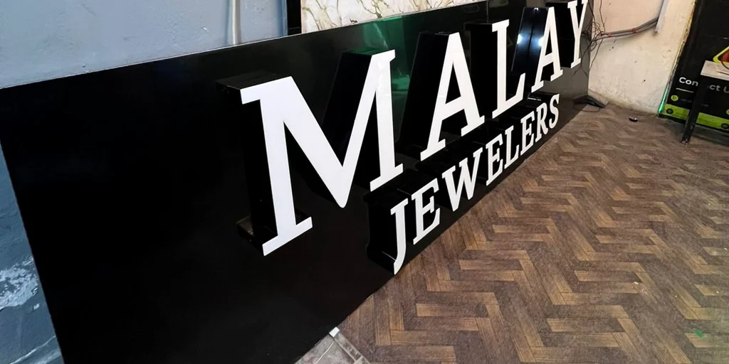
The white letters stand out strongly against the black base even without relying entirely on illumination.
That matters because retail signage spends a significant portion of its operating life in daylight. A design that only becomes attractive after dark is not enough.
Important daytime design factors include letter proportions, font selection, spacing, depth, panel color, alignment, and viewing distance.
In this project, the large “MALAY” lettering establishes the brand immediately. The smaller “JEWELERS” line tells customers what the business offers without competing visually with the main name.
This hierarchy makes the sign easier to understand within seconds.
Why the Black Background Panel Works
The black backing panel is more than a mounting surface. It is a major part of the visual composition.
White lettering requires sufficient contrast behind it. Installing white letters against a pale wall can reduce definition during daylight. A dark background solves that problem by giving every letter a clear boundary.
For the Malay Jewelers design, the black panel creates a controlled visual field behind the letters.
It also offers practical advantages where appropriate, including creating a cleaner mounting area and allowing electrical routing to be planned more neatly.
From a branding perspective, black and white are particularly effective for jewelry retail because the combination feels simple, elegant, and timeless.
Other successful background-and-letter combinations might include:
| Store Style | Background | Letter Finish |
|---|---|---|
| Contemporary jewelry | Matte black | White illuminated acrylic |
| Luxury jewelry | Black | Mirror or brushed gold |
| Premium minimalist | Charcoal grey | Warm-white letters |
| Modern boutique | White | Black halo-lit letters |
| Traditional jeweler | Deep navy | Gold fabricated letters |
| High-end watch store | Dark bronze | Champagne metal letters |
The correct combination depends on the architecture, brand colors, surrounding storefronts, and desired nighttime effect.
LED Illumination and Nighttime Visibility
Illuminating a channel letter involves more than placing LEDs inside it.
Professional lighting requires the modules to be positioned according to the internal dimensions of each character. Wide characters such as “M” require a different layout from narrower letters. Corners, strokes, spacing, acrylic properties, and letter depth all influence the final result.
The goal is even face illumination.
A poorly designed channel letter can develop visible LED dots, bright patches, dark corners, or inconsistent intensity between characters.
The finished Malay Jewelers sign demonstrates the intended result: a clean illuminated face that remains readable from a distance.
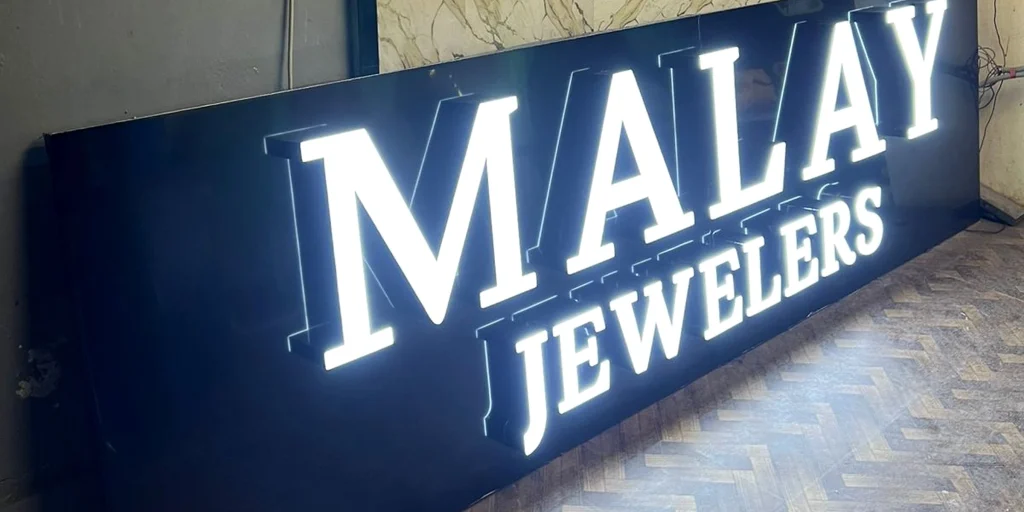
Night visibility becomes particularly valuable for stores located on busy commercial roads, shopping streets, plazas, and retail centers.
A sign may continue advertising the business long after customers would struggle to notice an ordinary printed fascia.
Inside a Professional LED Channel Letter
Although customers mainly see the illuminated face, much of the quality of the sign is determined by components hidden behind it.
A properly fabricated illuminated letter requires attention to several elements.
Acrylic Face
The front face needs to transmit the required amount of light while maintaining the intended color during both daytime and nighttime conditions.
Three-Dimensional Return
The return creates the depth of the letter and provides internal space for the LED system. It also has a major impact on the appearance of the sign when customers approach from an angle.
LED Modules
Commercial LED modules are arranged inside the letter to illuminate the face. Their spacing should be planned rather than randomly installed.
Wiring
Connections should be organized carefully using suitable electrical wiring. Exterior installations also require additional attention to environmental protection.
Power Supplies
The LED system needs correctly sized power supplies matched to the electrical load.
Mounting System
Letters must be securely attached to the panel, raceway, fascia, or building surface according to the installation design.
These hidden details are one reason professionally manufactured signage can perform very differently from inexpensive letters that look similar in a photograph.
Why Letter Depth Matters
Depth has both a technical and aesthetic purpose.
From a design perspective, deeper letters create stronger three-dimensional presence and better side visibility.
From a lighting perspective, the internal distance between the LED modules and acrylic face affects light diffusion. If the depth is too shallow for the design, individual LED points can become more noticeable.
Excessive depth is not automatically better, however. Oversized returns can make elegant lettering appear bulky.
The correct depth depends on:
- Letter height
- Stroke width
- Font style
- Acrylic type
- LED configuration
- Desired brightness
- Viewing angle
- Architectural scale
For premium Jewelry Store Signs, the objective is usually to create sufficient depth for professional illumination while maintaining a refined overall profile.
Designing Signage Around Viewing Distance
One of the most common signage mistakes is choosing letter sizes based only on how the design looks on a computer screen.
Real storefront signage is viewed from actual roads, sidewalks, parking spaces, and neighboring properties.
A customer several hundred feet away experiences the sign differently from someone standing directly underneath it.
Before manufacturing a custom storefront sign, designers should evaluate:
- Available fascia width and height
- Typical viewing distance
- Traffic direction
- Building height
- Obstructions such as trees and neighboring boards
- Existing storefront colors
- Brand logo proportions
- Required installation position
A wide storefront may require fewer but larger elements instead of squeezing excessive information into the available space.
Malay Jewelers uses a straightforward name-and-category layout for this reason. The brand gets priority, while the supporting wording remains clear.
Front-Lit, Halo-Lit or Non-Illuminated Letters?
Jewelry businesses have several strong signage options.
Front-Lit Channel Letters
The face illuminates toward the viewer. This provides excellent visibility and is the style used for the Malay Jewelers project.
Halo-Lit Letters
Lighting is projected onto the wall behind the letters, creating a glow around each character. Halo lighting can produce a more subtle luxury effect.
Dual-Lit Letters
These combine illuminated faces with rear halo lighting. They can create a more dramatic premium appearance when the site conditions are suitable.
Non-Illuminated Metal Letters
Brushed stainless steel, gold mirror, titanium finishes, and other metals can create exceptional daytime presentation where external lighting or indoor placement is available.
There is no single best option. The correct solution depends on brand identity, local installation conditions, budget, architectural restrictions, and required viewing distance.
Building a Sign for Shipping and Installation
For international signage projects, fabrication is only one part of the job.
Letters need to reach the project location without damaged faces, scratched finishes, bent returns, or broken electrical components.
That means packaging should be planned around the sign rather than treated as an afterthought.
Individual letters may require protective wrapping, foam separation, corner protection, or custom packaging depending on their size and finish.
Installation planning is also important before shipment. Templates, wiring layouts, mounting points, power requirements, and panel dimensions should be established before fabrication is finalized.
This approach can make installation easier for the client’s local sign installer and reduce unnecessary modifications on site.
How We Develop Custom Jewelry Store Signs
Our design and production process begins with the storefront rather than forcing every business into the same template.
A typical project includes reviewing the storefront dimensions, logo artwork, required viewing distance, lighting preference, building background, preferred materials, and installation method.
We can then determine whether front-lit channel letters, halo-lit letters, stainless-steel letters, acrylic lettering, glitter-finish sides, or another construction method is best suited to the location.
For international customers, visual mockups are particularly useful because they allow the client to review proportions and overall appearance before manufacturing begins.
The final objective is not merely to produce individual letters. It is to create a complete sign system that looks appropriate on the actual building.
Practical Design Tips for Jewelry Retailers
A jewelry storefront usually benefits from simplicity. A few carefully executed elements often look more premium than an overcrowded sign.
Consider keeping the main brand name dominant and moving secondary information to a smaller line. Avoid using several unrelated fonts on the same fascia.
Choose lighting temperature carefully as well. Bright white can create a crisp modern look, while warmer illumination may suit traditional gold and luxury branding.
Material samples and realistic day/night mockups can also help customers understand how finishes will behave under different lighting conditions.
Finally, design for long-term brand recognition. A storefront sign should still look appropriate several years after installation, not simply follow a short-lived visual trend.
Frequently Asked Questions
What type of sign is best for a jewelry store?
Illuminated channel letters, halo-lit metal letters, and premium fabricated stainless-steel lettering are all strong choices. The best option depends on the storefront architecture and brand positioning. Front-lit acrylic channel letters provide excellent visibility, while halo-lit letters create a softer luxury appearance. High-end businesses often combine simple typography with black, white, gold, champagne, or brushed-metal finishes.
Are acrylic channel letters suitable for exterior use?
Yes, when manufactured using materials and electrical components intended for exterior signage. The acrylic face provides the illuminated surface while the fabricated letter body houses LEDs and wiring. Outdoor installations should also consider weather protection, suitable power supplies, secure mounting, sealed electrical connections, drainage where necessary, and local electrical requirements.
How bright should Jewelry Store Signs be at night?
They should be bright enough to remain clearly readable at the required viewing distance without creating uncomfortable glare. Brightness depends on letter depth, acrylic transmission, LED density, surrounding ambient lighting, and sign size. A store on a brightly illuminated commercial road may require a different LED configuration from a boutique located in a darker shopping environment.
What is the difference between acrylic letters and channel letters?
Acrylic letters can be simple solid shapes cut from acrylic sheets. Channel letters are hollow three-dimensional fabricated characters designed to contain LEDs and electrical wiring. Many illuminated channel letters use acrylic for their front faces, which is why both terms are sometimes used together. Channel letters generally provide greater depth, stronger visibility, and more professional internal illumination.
Can channel letters be produced in gold or other colors?
Yes. Acrylic faces, side returns, metal surfaces, coatings, and lighting effects can be customized according to the brand. Jewelry retailers commonly choose white, black, gold, champagne, silver, bronze, or warm-white combinations. Mirror stainless steel and brushed finishes can also create premium results, although the final material choice should consider the installation environment and desired day/night appearance.
Can custom signage be manufactured for overseas installation?
Yes. Signage can be fabricated according to supplied storefront dimensions and prepared for shipment to international customers. Accurate drawings, artwork, mounting information, electrical requirements, packaging, and installation planning become especially important when the manufacturer and installation team are in different countries. A local licensed installer may also be required depending on the destination and applicable building or electrical regulations.
Should a jewelry store choose white or warm-white lighting?
Both can work well. Bright or neutral white creates a crisp contemporary appearance and strong visual contrast, particularly against black backgrounds. Warm-white illumination often complements gold, bronze, wood, and traditional luxury interiors. The best choice should be made together with the letter finish, storefront colors, logo identity, and surrounding exterior lighting rather than selecting LED color separately.
A Storefront That Reflects the Brand
The completed Malay Jewelers USA project shows how simple design choices can create a strong premium result when the fabrication is executed carefully. White illuminated acrylic faces, black three-dimensional sides, an uncluttered background, balanced typography, and consistent LED lighting give the storefront a clear identity during both daytime and nighttime conditions.
Great Jewelry Store Signs should do more than display a company name. They should make the business easier to recognize, support the quality of the brand, and create a storefront customers remember.
For jewelry retailers planning a new location, renovation, or brand upgrade, investing in properly designed three-dimensional signage can turn an ordinary fascia into one of the strongest visual assets of the business.