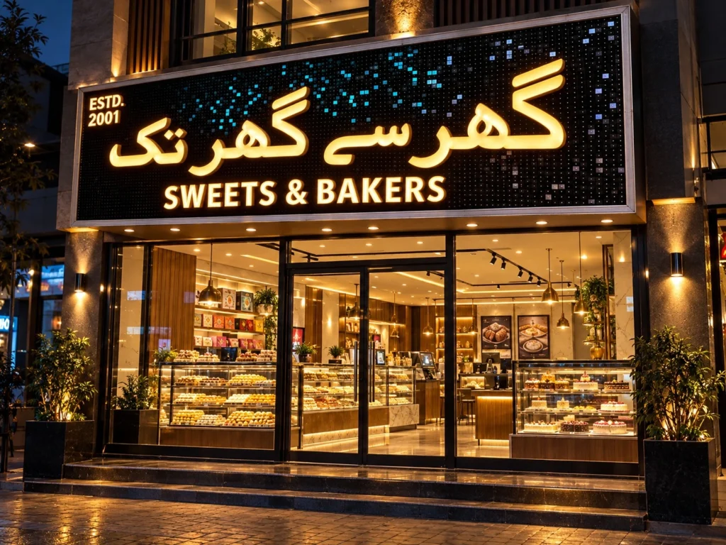
A strong storefront needs more than a printed name. It needs dimension, contrast, professional lighting, and materials that make the business visible in both daylight and at night. For one of our recent signage projects, we produced acrylic signs custom for a sweets and bakery business using illuminated acrylic lettering, internal LED modules, a decorative black background, and a fully illuminated border.
This project is a useful example of how a commercial sign develops from the fabrication stage into a finished illuminated storefront feature. The process involved preparing the acrylic lettering, arranging LEDs, completing electrical connections, testing the sign, and checking the final glow before dispatch.
Project Overview: Custom Illuminated Sweets & Bakers Sign
The client required a large commercial sign combining Urdu branding with English supporting text.
The finished design included:
- Custom Urdu lettering
- “SWEETS & BAKERS” in English
- “ESTD. 2001” detail
- White acrylic illuminated letters
- Warm-white LED lighting
- Black decorative background
- Reflective square detailing
- Illuminated perimeter border
- Internal wiring and power system
- Three-dimensional letter construction
The black background was particularly useful because it created strong contrast behind the white lettering. During daylight, the acrylic letters remain clearly visible. Once the lighting is switched on, the sign develops a completely different appearance.
That combination of daytime presentation and nighttime visibility is one of the main advantages of professionally fabricated illuminated signage.
What Type of Sign Is This?
This project combines 3D acrylic-faced illuminated letters with a custom decorative sign panel.
The large lettering is not simply printed onto the background. Each major character has physical depth and contains its own LED lighting arrangement.
A typical illuminated acrylic letter consists of several components:
- Cut acrylic face
- Fabricated letter structure
- LED modules or LED strip
- Electrical wiring
- Supporting back section
- Mounting points
- Power supply
The front acrylic acts as the visible face of the letter and helps diffuse the light coming from inside.
Unlike a flat printed flex or vinyl sign, fabricated acrylic lettering creates real depth. Customers can see shadows and side profiles during the day, while the internal lighting provides strong visibility after dark.
Stage One: Building the Lettering and Sign Structure
The production process begins long before the lights are switched on.
The artwork must first be prepared according to the final sign dimensions. For custom Urdu lettering, this is especially important because curves, connections, and decorative strokes need to retain their correct proportions when scaled to a large physical size.
Once the artwork is finalized, the letter shapes can be cut and prepared for fabrication.
At this stage, the sign is still a manufacturing project rather than a finished visual display.
Individual sections need to be aligned carefully against the main background. Letter spacing is checked, the English line is positioned correctly, and the Urdu characters are adjusted so the overall composition remains balanced.
This stage also gives the production team the opportunity to make practical adjustments before final electrical work begins.
A letter that looks perfectly positioned on a computer screen may need slight movement once it is viewed at full physical scale.
Why Acrylic Is Used for Illuminated Sign Letters
Acrylic is one of the most widely used materials for illuminated commercial signage because it offers several useful properties.
It can be cut precisely, shaped into detailed forms, and manufactured in different colors and thicknesses. More importantly for illuminated signage, translucent acrylic can distribute LED light across the front surface.
A good acrylic face helps transform separate LED points into a smoother illuminated area.
The quality of that result depends on several factors:
- Acrylic thickness
- Opacity
- LED spacing
- Letter depth
- LED brightness
- Internal reflection
- Shape of the character
Simply installing LEDs behind acrylic does not guarantee a professional result.
The entire letter has to be designed so the light spreads evenly.
Acrylic Signs Custom and the Importance of Letter Depth
When producing acrylic signs custom for a commercial project, letter depth is one of the most important technical decisions.
If LED modules are positioned extremely close to the acrylic face, individual light points may become visible.
If the letter is deeper, the light has more space to spread before reaching the acrylic.
However, depth also affects appearance.
Very deep letters create a strong 3D profile, which may suit a bold storefront. A more refined sign may require a shallower profile.
The correct depth depends on the size of the letters and the intended viewing distance.
Larger characters generally need enough internal room to distribute light evenly across broad strokes.
LED Placement Inside Custom Lettering
LED placement requires planning because every character has a different internal shape.
A straight English letter is relatively simple compared with a complex Urdu character containing long curves, narrow sections, or connected strokes.
The lighting technician has to follow the form of the letter rather than applying the same pattern to every character.
LEDs need to provide coverage across:
- Wide strokes
- Tight curves
- Corners
- Long horizontal sections
- Narrow connecting sections
- Decorative elements
The objective is a consistent glow.
If modules are placed too far apart, dark areas may appear. If they are installed too closely, the letter can become unnecessarily bright while using more power.
Correct spacing produces better illumination and improves efficiency.
The Decorative Black Background
The sign panel itself plays a major visual role in this project.
Rather than using a plain black sheet, the background contains many small reflective details. These elements create texture and add depth without competing with the main lettering.
During daylight, they break up the large black surface.
At night, they catch small amounts of surrounding light and contribute to the premium appearance of the sign.
Black is an effective background for white acrylic lettering because of the high contrast between the two.
The result is easy to read even before illumination is activated.
For bakeries, restaurants, jewelry stores, fashion retailers, and premium shops, a controlled dark background can help the illuminated elements stand out more clearly.
Adding the English Supporting Text
The Urdu brand name is the primary visual feature, but the English line also plays an important role.
“SWEETS & BAKERS” immediately communicates the business category to customers who may not read the main script.
This is useful for commercial signage in multicultural markets.
Supporting text should remain secondary to the brand name. If both lines compete for attention, the sign can become visually confusing.
For this project, the larger Urdu lettering establishes the identity, while the English wording provides additional information.
The hierarchy is clear from a distance.
Incorporating “ESTD. 2001”
The “ESTD. 2001” element adds another layer of branding.
Established dates can be particularly useful for food businesses because they suggest history and continuity.
They should normally remain smaller than the primary business name.
In this design, the established date occupies a corner of the board where it can be noticed without interfering with the central branding.
Small secondary elements like this work best when they have enough breathing space.
Crowding every available section of a sign with text usually reduces the overall impact.
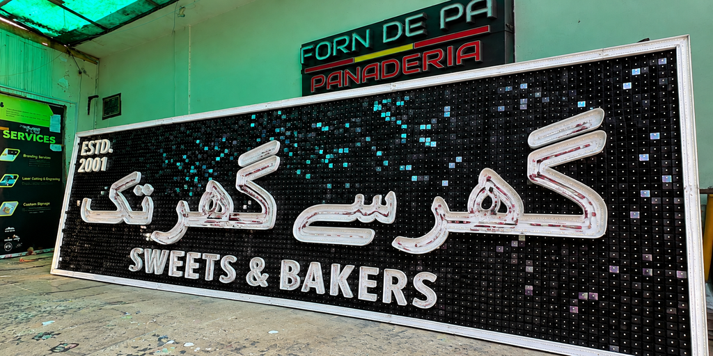
Stage Two: Completed Construction Before Final Illumination
Once the letters are fabricated, mounted, and wired, the project reaches an important inspection stage.
At this point, the sign can be examined as a complete physical object before full illumination testing.
This stage is useful for checking several details:
- Overall alignment
- Letter spacing
- Urdu character proportions
- English text positioning
- Border construction
- Background finish
- Acrylic edges
- Electrical routing
- Physical stability
Seeing the complete sign at full size also helps confirm that the visual hierarchy works.
The sign needs to make sense from several meters away, not only from directly in front of it.
Why Large-Scale Viewing Matters
One common signage mistake is designing only for the computer screen.
A sign can look perfectly balanced at a small scale but behave differently once manufactured several feet wide.
Viewing distance changes how people perceive:
- Letter thickness
- Spacing
- Contrast
- Small wording
- Logo details
- Lighting intensity
A storefront sign should therefore be judged from the approximate distance at which customers will actually see it.
If a sign will face a road, large lettering becomes more important.
If it is located inside a mall corridor, smaller details may remain effective.
Electrical Wiring and Power Management
The visible part of the sign is only half the project.
Behind the illuminated acrylic are wiring, connectors, LEDs, and power supplies that need to operate reliably.
A properly planned electrical system considers:
- Total LED load
- Required voltage
- Power-supply capacity
- Wire size
- Distribution points
- Maintenance access
- Heat
- Moisture protection
- Safe cable routing
For large illuminated signs, the electrical load may be divided across multiple power supplies.
This provides more controlled power distribution and can simplify servicing later.
Exterior installations also require suitable protection against rain, humidity, and temperature changes.
Why Warm-White Illumination Works for a Bakery
Lighting color can completely change the character of a sign.
Bright cool white often creates a sharp contemporary appearance, while warm white generally feels softer and more inviting.
For a sweets and bakery business, warm lighting can complement the category well because it resembles the visual warmth associated with baked products, cafés, dessert shops, and hospitality spaces.
The black background also helps warm-white LEDs appear richer.
However, the best light temperature should always be selected according to the brand colors and surrounding storefront.
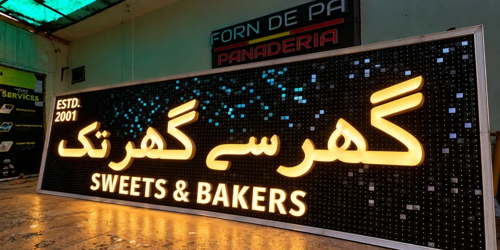
Stage Three: Final Lighting Test
The final glow test is where the complete design comes together.
After all electrical work is finished, the sign is powered on and inspected under lower ambient lighting.
This stage reveals issues that cannot always be identified while the sign is switched off.
The team checks:
- Dark areas
- Excessively bright sections
- Uneven LED spacing
- Border illumination
- Wiring problems
- Failed modules
- Color consistency
Every major letter should appear balanced.
The border also needs consistent brightness so one section does not look stronger than another.
Testing the complete unit before dispatch reduces the likelihood of issues appearing after installation.
The Illuminated Border
The perimeter lighting is an important part of this design.
It frames the entire sign and helps separate the board from the surrounding wall or building surface.
At night, this creates a strong rectangular outline even from a long distance.
Border lighting can be produced using suitable LED systems depending on the required effect.
It should complement the lettering rather than overpower it.
If the border is dramatically brighter than the brand name, the viewer notices the shape of the board before the business identity.
Balancing both elements creates a more professional result.
Where Acrylic Signs Work Best
Illuminated acrylic signage can be adapted for a wide range of businesses.
Common applications include:
- Sweets and bakeries
- Restaurants
- Cafés
- Grocery stores
- Jewelry stores
- Fashion retailers
- Pharmacies
- Salons
- Mobile shops
- Convenience stores
- Shopping centers
- Corporate offices
- Medical clinics
The design does not need to follow one fixed appearance.
A bakery might use warm-white light, while a pharmacy may use bright white or green. A jewelry store may select gold and warm-white finishes. A modern technology retailer may prefer clean white acrylic with dark metallic sides.
Acrylic vs. Other Commercial Sign Materials
Different materials create different effects.
| Material | Best Feature | Common Application |
|---|---|---|
| Acrylic | Excellent illuminated face | Channel letters |
| Stainless steel | Premium metal finish | Luxury signage |
| Aluminum | Lightweight and durable | Exterior letters |
| PVC | Cost-effective dimensional signs | Indoor branding |
| ACM | Strong backing panel | Storefront fascia |
| Flex | Economical large-area graphics | Backlit boxes |
| Neon flex | Decorative continuous lighting | Logos and interiors |
For acrylic signs custom, acrylic is usually only one component of the final sign. It may be combined with metal returns, PVC backing, aluminum panels, LED systems, or other structural materials.
The best combination depends on the design and installation conditions.
Preparing a Custom Sign for Shipping
For a custom signage project, manufacturing quality is only part of the job.
The sign must also survive transportation.
Large fabricated letters and acrylic components can be damaged if they are allowed to move inside packaging.
Protective packing may include:
- Foam sheets
- Protective film
- Corner guards
- Separate component wrapping
- Reinforced cartons
- Custom crates
- Wiring labels
- Installation drawings
Acrylic faces should be protected from scratching.
Electrical components also need protection from impact and pressure.
Clear component identification can make installation significantly easier, especially when the sign is transported to another location.
Installation Planning
Installation should be considered before fabrication starts.
The manufacturer needs to understand:
- Final sign dimensions
- Wall construction
- Mounting height
- Available electrical supply
- Installation access
- Building restrictions
- Local sign regulations
- Viewing distance
Local permitting and electrical requirements can vary by location.
A licensed installer may be required depending on the project and jurisdiction.
Manufacturing drawings and accurate dimensions help the installation team understand how the sign has been designed.
Common Problems With Poorly Made Acrylic Signage
Low-quality illuminated signage may initially look acceptable, but problems often appear later.
Typical issues include:
- Visible LED spots
- Uneven illumination
- Cracked acrylic
- Weak bonding
- Water entering the letter
- LED failure
- Loose wiring
- Poor alignment
- Inconsistent brightness
Many of these issues are caused by shortcuts taken during fabrication.
A professional sign should be designed for maintenance as well as appearance.
LEDs and power supplies may eventually require servicing, so access should not be unnecessarily difficult.
Frequently Asked Questions
What Does Acrylic Signs Custom Mean?
Acrylic signs custom refers to signage manufactured according to a specific business logo, lettering, dimensions, colors, and lighting requirements rather than using a standard premade design. Acrylic can be laser or CNC cut into letters and shapes, then combined with LEDs, metal sides, backing panels, or other materials to create illuminated and non-illuminated commercial signs.
Are Acrylic Letters Suitable for Outdoor Use?
Yes, suitable acrylic can be used in exterior commercial signage when the complete sign is manufactured correctly. Outdoor performance depends on more than the acrylic itself. The LEDs, wiring, power supplies, mounting hardware, joints, and other structural materials must also be appropriate for exterior conditions.
Can Acrylic Signs Include Urdu and English Lettering Together?
Yes. Custom fabrication allows different scripts, fonts, logos, icons, and supporting text to be produced within the same sign. Accurate vector artwork is particularly helpful for Urdu lettering because it preserves curves and connections when the design is scaled for manufacturing.
How Are Acrylic Letters Illuminated?
LED modules or LED strips are installed behind or inside the acrylic lettering. Light passes through the translucent acrylic face, creating the illuminated effect. The spacing between the LEDs and the acrylic needs to be planned carefully to prevent visible hot spots or dark sections.
What Color Lighting Is Best for a Bakery Sign?
Warm white works particularly well for many bakeries, dessert shops, and cafés because it creates a welcoming appearance. Bright white can produce a more contemporary look. Brand colors, building materials, surrounding lighting, and required visibility should all influence the final decision.
Can Custom Acrylic Signs Be Shipped to Another Country?
Yes. Properly fabricated signs can be packaged for transportation and installed at their destination. Accurate dimensions, electrical specifications, installation drawings, protective packaging, and local code requirements should be addressed before manufacturing and dispatch.
How Do You Test an Illuminated Sign Before Shipping?
The complete sign is powered on so the manufacturer can inspect brightness, LED coverage, electrical connections, color consistency, and the border lighting. Any dim areas or failed components can then be corrected before the sign is packed.
From Fabrication to the Final Glow
This sweets and bakery project demonstrates how a custom illuminated sign develops through several important production stages. The lettering is first fabricated and positioned, followed by LED installation, electrical work, final assembly, and complete illumination testing.
The black decorative background, white acrylic letters, warm lighting, English supporting text, Urdu branding, and illuminated border all work together to create a sign that performs during both the day and night.
Professionally manufactured acrylic signs custom should not simply look attractive when photographed. They should be readable, properly illuminated, structurally sound, serviceable, and designed around the real storefront where they will eventually be installed.